<div id=rChart-1003-1050><svg></svg><div>
RHQ 4.7
RHQ D3 Charting
The newest iteration of RHQ charting uses the D3(http://d3js.org) javascript charting library to render charts in modern browsers that are SVG capable. d3 stands for Data Driven Documents and is much more than a charting library. d3 is a collection of data visualation tools that allow the joining of data (via json, xml, csv, and tsv) to javascript elements such as Html div tag or SVG rect tag. It is low level enough that the developer needs to determine the output rendering technology such as HTML, SVG, Canvas or WebGL. And then using the shape elements provided in the output technology, the developer draws (or maps) the shapes to the target coordinate system, sizing the shapes proportionately to make a proper looking chart. This, low level rendering toolkit is what makes D3 both powerful and also more cumbersome than a traditional charting API.
Chart Types
For representing data coming from RHQ resources we have chosen a Stacked Bar Graph that represents the discontinuous, interval nature of the RHQ data with a line graph connecting the averages to show trendiness of data. Many real-time systems use continuous area charts to show the streaming data. As RHQ/JON is not intended as a real-time monitoring charting application, the data being pulled from the metrics engine is queried from its aggregated buckets depending on the time interval requested.
Aggregate Chart Type
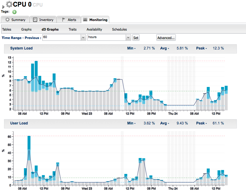
Aggregate bars like the ones shown above represent buckets of time from which data is sampled at various intervals and represented by its Peak, Average and Minimum.
Chart Legend
-
Dark Blue segment shows Average to Peak values for the bar interval
-
Light Blue segment shows Minimum to Average values for the bar interval
-
Grey Bar segment leading up to the Minimum is just filler
-
Black Line runs through the averages helping to visualize Trendiness
Min, Avg and Peak
-
Light Blue Dotted Line: Minimum value over the period shown
-
Red Dotted Line: Peak value over the period shown
-
Green Dotted Line: Average over the period shown
Availability:
-
Red Vertical Bars Horizontal Stripes: Resource is Down from availability data
-
Blue Vertical Bars Horizontal Stripes: Resource is Unknown from availability data
-
Grey Vertical Bars Horizontal Stripes: No Data (we receive a record with a timestamp from the metrics database but no values)
Out-of-Bounds Data (OOB)
-
Purple Dashed Line: Min Baseline from OOB
-
Orange Dashed Line: Max Baseline from OOB
NOTE: The way availability is shown is under design review and is likely to change in the near future.
Single Value Charts (Non-aggregate)

The above chart represents 4 minute bars which are not aggregates because at this granularity only a single value is collected. Meaning there is no Peak, Avg or Min values just a single value shown by the heavier cap over the bar. The light and dark blue regions of the aggregate stacked bar don't exist because there is only one value (not an average but an actual value). For clarity, the connecting average line has also been removed just to highlight the individual values.
Multi-Resource Chart

The multi-resource chart above shows User Load measurement across multiple resources (CPUs). The graph type here is a line graph as opposed to our normal stacked bar graph due to the fact that multiple resources would produce a chaotic looking graph with anything other than the line graph.
Creating a d3 Chart
The process of creating a d3 chart from code is a two step process:
1. The first step is for GWT to create the foothold so that when d3 is invoked in the second step to bind to this section of the page, it has a unique identifier to bind. For our purposes the unique id is: 'rChart'+ entityId + measurementDefinitionId, for example:
2. The second step is to tell d3 to bind to the unique id defined in the first step. Because d3 is a javascript library, javascript is accessed via GWT JSNI. Now, that there is an element to bind to on the page, d3 can bind to that unique element and begin to create its SVG elements there. d3 uses this foothold in the page to begin creating its SVG elements representing the chart.
 // chartContext.chartSelection = "div#rChart-1003-1050 svg";
 var chart = $wnd.d3.select(chartContext.chartSelection), // create the d3 chart object
     svg = chart.append("g")
                .attr("width", width + margin.left + margin.right)...adding more attributes...now start adding SVG elements to build the chart
Populating RHQ d3 Charts
As d3 charts are javascript, we need to produce a javascript-friendly way of passing data from java to javascript. JSON fits the job nicely, as it is javascript's native serialization format. Metrics are queried from the RHQ database and then a JSON document is produced to feed to the d3 chart as input. D3 then parses the JSON data and binds the data to the SVG elements. The job of the programmer is to create javascript functions that look at the data and draw various SVG shapes on the screen, similiar functions govern the look/behavior of the shapes by changing the shapes attributes. Using these technics it is possible to build very sophisticated charts from basic shapes and also specify the interactions with the shapes. More on this later.
Chart Detail Through Hovers
Another aspect to the interactiveness of the d3 charts is though hovers. Hovers give us closer inspection of the underlying data in the chart.

As depicted in the above screenshot, the hover shows:
-
Date/Time of the start of the interval for the bar
-
The bar duration
-
The metrics for the bar: Peak, Avg, Min